Correct Option (1)
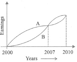
Based on the visual representation in the graph, A's earnings consistently exceeded B's earnings for a significant portion of the period, specifically from 2000 to 2007. While there might be fluctuations or periods where B's earnings surpassed A's in later years, the cumulative effect over the entire decade indicates that the average earnings of A were higher than those of B. Therefore, it can be concluded that, on average, A earned more than B during this period.
Incorrect Options:
The following options are incorrect:
-
Option 2: On the average B earned more than A during this period. This statement is contrary to the visual evidence presented in the graph, which shows A's earnings being predominantly higher for a substantial part of the period, leading to a higher average for A.
-
Option 3: The earnings of A and B were equal during this period. This is incorrect. The graph clearly depicts distinct earning patterns for A and B, with one consistently higher than the other for significant durations, indicating unequal total and average earnings over the period.
-
Option 4: The earnings of A were less as compared to B during this period. This statement is incorrect. As established by the analysis of the graph, A's earnings were generally higher than B's for a majority of the period, implying that A's overall earnings were not less than B's.